First things first—doesn’t anyone else find it funny that there are 10 13 new posts here in the past couple days? No, just me? Ok…
How is everyone today? I’m a bit miffed writing this, because I’m not scoring as well as I would like in this class, according to my critique and dossier grade (pre-med problems, am I right?). No biggie, I can do better next time, but I’ve got to solve a very important problem first. In our presentation, we gave a lot of information—probably too much as we went a good 2 or 3 minutes over time. Having this information is great, but the problem seems to be that we couldn’t convey it effectively. My introductory linguistics professor described it well: language is used to take an idea in one’s head and vibrate some air with some flaps in our body in such a way that another person in the vicinity can have the same idea. We could not accomplish this pseudo-telekinesis, so we didn’t do as well as we wanted.

I can guess what you’re thinking though: “Wah-wah. That’s not a real problem. How does this apply to me?” Well, I figure that if we cannot get an idea across accurately to doctors, professors, and others sufficiently, what chance do we have of getting the same (or other) ideas across to the patients that we aim to empower?
There are a couple of things we could do, actually. For one, we can work on basic presentation style, so that the information we give is more engaging for an audience. We can also make analogies. When you simplify an idea by comparing it to other things (e.g. the heart to a pump) people can get a better sense of what something truly means and can figure out implied effects or solutions of that thing.
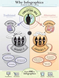
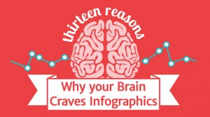
However, one new trend that is becoming more and more used is called an inforgraphic. For those of you who don’t know what that is, it’s basically some type of image that conveys information, usually in a fun and easily digestible manner. If you want a few examples, here’s like 80 of them. Info graphics are useful because people only really read a portion of the information they encounter, according to Dr. Paul Lester in his paper “Syntactic Theory of Visual Communication” . People following instructions with infographics are much better at following them than without and adding pictograms to medicine labels increased patient compliance significantly (around 25%). And honestly, infographics are just fun. People like them—a lot. If you want to know more about why we like infographics, check out this one. I know I put up a lot of links, but you seriously should check it out.
No, seriously. Look at it. It’s pretty great. I’ll wait.
Anyway, I feel that both in our next presentation and in our solution, it would be a great idea to create some visual representation of our information. I’ve been looking up infographics and how they work so we can harness their powers for good, but honestly, this information is pretty useful for us all.


