Author Archives: Obi

Quantified Self vs quantified self

I’ve mentioned a couple of his videos before, but last week, my favorite YouTube channel—PBS Idea Channel (and the host, Mike)—released an episode titled “How Much Can Data Improve Your Health?”

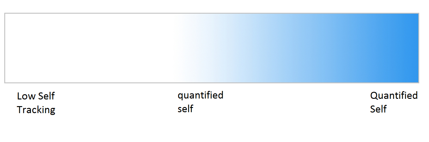
In the video, Mike talks about the Quantified Self: “that data about or from your body, usually gathered by gadgets, will lay bare and inspire you to improve your body-temple-wonderland.” He mentions that as time passes, gadgets not only get smaller, but also closer to—and possibly inside—the body. With the data we get, we can crunch the data and learn interesting things about ourselves. According to Mike, this is what Whitney Erin Boesel uses to differentiate the ideas of “quantified self” in lower case—having and knowing the data–and “Quantified Self” with title case—knowing and using the data. “Practitioners of the latter don’t just self track. They interrogate the experiences, methods, and meaning of their self tracking practices…”

One interesting thing to think about: what IS the population doing with their data?  First, I can talk about this from a personal standpoint. I have two main devices that put me within the Quantified Self spectrum: I have a Nike+ fuel band that tracks motion and a sleep cycle app on my phone that tracks my sleep (side note, I’m experimenting a bit with different apps in the latter to see what kind of information I can get). If we wanted to put me on a continuum for quantified self, I would be unequivocally within the movement (knowledge the movement itself assumed to be a non-issue), but nearer to the “quantified self” end than to the “Quantified Self” pole.

QS spectrum

That’s because, while I have this information, I’m not actually using it to do anything. I’m actually content with just the knowledge. Maybe I’d realize that I need to walk a little more tomorrow, or sleep earlier, but I’m still not doing much with all this data I have. Now, I realize that my team’s project has moved away from self tracking per se, but I still feel that this is interesting to talk about for patients and for what we know about patients tracking their data. Being part of the Quantified Self movement takes a LOT of energy (and the motivation accompanying it). I—and Mike as well—have a sense that people who track healthcare information tend to be part of the quantified self movement because of the effort required to be in the other camp. This isn’t a new idea; I’ve talked about it before. Having people put in effort is hard, it is a barrier to access and for patients, and it is a steep hill on the way to becoming more engaged in healthcare. It should be interesting to do a bit more research and learn if self-tracking itself leads to better outcomes, or if the engagement of the self-tracking has that effect.

Another related issue Mike mentioned was about data, “The objectivity of the information upon which they crunch is only just a shade of such….the transition from data to information is not a net 0 process.” He goes on to mention that the data doesn’t necessarily represent reality: “…the existence of a datum has been independent of consideration of any corresponding ontological truth.” This is more of an issue for our group, but it is one we have already considered and are working on a solution. Essentially, patients can give information, but we have no way of verifying its veracity until they are seen by an actual person (and even then, subjective, qualitative experiences like pain still elude external scrutiny), nor can we be sure that correct data represents that which we want to represent. For example, if a patient used our app that we proposed and with it mentioned that they are feeling pain and there is some discoloration of the knee, the patient’s relevant healthcare professionals—a doctor and/or nurses—would be told that there is some potentially severe problem like an infection. Yet the data could show the same symbols if the patient, say, got a tan and bumped it a few minutes prior.

He concludes by noting that the mass produced consumer products that we buy to track health data are often not to emphasize effectiveness in using the consumer’s own data, but rather to compare and compete with other people or with some “fitness ideal” that holds a standard towards which one should be working, because body competition is the focus of a lot of things in our world. Yet, they both allow us to learn more about ourselves, and thus act more effectively in the world.

Principles of Design (abridged)

4448610287_db3f03fa08_o

Good UI design is KEY

Last time, I discussed why design considerations are fairly important. Now, I want to discuss some of the actual principles in design. Today, I want to discuss some Human-Computer Interaction principles in general, as they are of more general use to everybody. I also want to note the principles involved specifically with mobile apps and mobile health apps, but to remain brief, I will stick to one topic at a time. Honestly, I could probably write pages on this subject: It is important, I began a class on it some time ago, and there is enough material to teach entire courses on the topic (see:  1  and 2 , at Rice.)

Most general design principle information actually comes from psychological principles dealing with perception, attention, and memory. We use these higher level functions to interact in the world and with our devices, so they must take them into account. In An Introduction to Human Factors Engineering, as pulled from Wikipedia, Christopher Wickens et al. defined 13 principles of display design, which can be readily used in mobile app design as well as in designing other things, as they mostly deal with the higher level cognitive abilities I just mentioned.  They can divided into a few subgroups, of which I shall talk about instead of the actual principles, because that would take too long. If you’re interested though, take a look at the above link.

Perceptual Principles

These principles revolve around the idea that, as people, we can only perceive reality in certain ways, and design needs to accommodate for that. The size of the display we have is limited (iPhone or Android or other smartphone screens), and they must be readable to the majority of the patients, many of whom are old and are losing eyesight. Alternatively, we can remove as much text as possible and use symbolic stand-ins and videos. One of the principles, redundancy gain, is rather useful, as it suggests that by presenting a signal more than once, even in different physical forms, the client will understand it better.

Mental Model Principles

We have past experience with the way the world is organized, so going into an app or other resource, we have some idea about how they are supposed to work. This is one of the large reasons why testing a project with a designed interface with a small sample size is good: the developers are likely to be tech-savvy, and if their population does not have the same expertise, ideas that seem simple to the devs will be difficult for the users.

I'm using twice, but its so relevant!

I’m using twice, but its so relevant!

Principles Based on Attention

A display will have the client divide their attention into multiple areas. The distance between areas should be minimized to reduce the small but certainly present cognitive load that results from the distance between elements in a display. Using multiple resources to present information helps here too.

Memory Principles

Generally, we want to reduce the amount of memory clients have to spend trying to make an application function. We can do that by “piggybacking” on their existing knowledge (as I mentioned earlier), by predicting actions for them (e.g. pulling up a list of what exercises they will need to do that day), and by being consistent across displays.

The Face-up side is not immediately obvious. Not good design, at least to us

The Face-up side is not immediately obvious. Not good design, at least to us

The design strategies themselves, of course go much deeper than that, but as Wickens et al. proved, one could write an entire book on the matter. These considerations, however, will certainly be useful in app design.

Why do we need design?

A joke I’ve often heard before is about engineers and their inability to actually design apps. The gist is that the engineers have large amounts of creativity and technical expertise and can create amazing devices, but the actual interface is designed terribly. Now, obviously this isn’t the case in real life: engineers are just as good as the general population in general interface design properties, if not better.  The problem is that, to make a good interface, one needs to put in some serious research and effort. I learned from a human factors class that, when you design something, you want it to be so good that your consumers don’t realize that there could be any other design.

engineer design

One important factor to note is that the device in which the interface is used on is extremely important to understanding the design. Earlier in the year, my design team tossed around ideas about some sort of web app or website, so I looked around a little on the internet and learned about WIMPs

But not that kind of wimp. WIMP http://en.wikipedia.org/wiki/WIMP_(computing) is a term in human-computer interaction which stands for “windows, icons, menus, pointer.”  These are elements that are—or were—supposed to be used in user interfaces, and have been in place for a few decades now. WIMP interfaces have:

  • Window: a usually rectangular area which runs a self-contained program or application.
  • Icon: A symbol used as a shortcut that represents and execute an action or run an application
  • Menu: A list or sets of lists that allow a user to select and execute programs and tasks, and are often in “pull-down menu” format.
  • Pointer: an onscreen navigation symbol that allows a user to select things.

All these seem very basic right? You’re probably reading this post on a computer that uses these elements as part of the UI, on an internet browser that also uses a WIMP-style GUI (Graphical User Interface). In fact, but a decade ago, this was the dominant form of UI design. As I mentioned before, the thought was generally “Well of course you design an interface that way. How else could you design it?!” Later, we got the iPod, which was one of the major players in moving away from this system due to the lack of true windows (the iPod used different screens instead of discrete windows), icons (text was used), and pointer (no actual pointer, but the blue “select” option served the same purpose). Now, we have interfaces that no longer require WIMP-style interfaces: touchscreen devices, augmented or virtual reality systems, and voice or gesture based systems. They are considered post-WIMP interfaces and rely on different types of design elements.

I’m going to come back to this topic: I find it useful for anybody that wants to design a product or companion for some kind of service. For now, though, I just want to leave with this: the design elements of a device must be considered carefully. Not only do computers have different design strategies than mobile devices, but the design strategies will differ between iOS, Android, and Windows apps. With this in mind a little research on design will prove fruitful.

Engineering Conferences

Conveying information (Feat. The best infographic ever)

First things first—doesn’t anyone else find it funny that there are  10  13 new posts here in the past couple days? No, just me? Ok…

preview

How is everyone today? I’m a bit miffed writing this, because I’m not scoring as well as I would like in this class, according to my critique and dossier grade (pre-med problems, am I right?). No biggie, I can do better next time, but I’ve got to solve a very important problem first. In our presentation, we gave a lot of information—probably too much as we went a good 2 or 3 minutes over time. Having this information is great, but the problem seems to be that we couldn’t convey it effectively. My introductory linguistics professor described it well: language is used to take an idea in one’s head and vibrate some air with some flaps in our body in such a way that another person in the vicinity can have the same idea. We could not accomplish this pseudo-telekinesis, so we didn’t do as well as we wanted.

I can guess what you’re thinking though: “Wah-wah. That’s not a real problem. How does this apply to me?” Well, I figure that if we cannot get an idea across accurately to doctors, professors, and others sufficiently, what chance do we have of getting the same (or other) ideas across to the patients that we aim to empower?

There are a couple of things we could do, actually. For one, we can work on basic presentation style, so that the information we give is more engaging for an audience. We can also make analogies. When you simplify an idea by comparing it to other things (e.g. the heart to a pump) people can get a better sense of what something truly means and can figure out implied effects or solutions of that thing.

However, one new trend that is becoming more and more used is called an inforgraphic. For those of you who don’t know what that is, it’s basically some type of image that conveys information, usually in a fun and easily digestible manner. If you want a few examples, here’s like 80 of them.  Info graphics are useful because people only really read a portion of the information they encounter, according to Dr. Paul Lester in his paper “Syntactic Theory of Visual Communication” . People following instructions with infographics are much better at following them than without and adding pictograms to medicine labels increased patient compliance significantly (around 25%). And honestly, infographics are just fun. People like them—a lot. If you want to know more about why we like infographics, check out this one.  I know I put up a lot of links, but you seriously should check it out.

No, seriously. Look at it. It’s pretty great. I’ll wait.

brain1

Anyway, I feel that both in our next presentation and in our solution, it would be a great idea to create some visual representation of our information. I’ve been looking up infographics and how they work so we can harness their powers for good, but honestly, this information is pretty useful for us all.

You think this is a game?

19835

I probably play too many video games. What can I say? They’re fun! Game developers try to make their games more fun (and get more money) by employing a range of psychological techniques that not many people are very aware of. Even early arcade-style games tried to keep kids playing and paying with public leaderboards and unforgiving mechanics. What I mean to show with these examples is that game developers are really good at shaping people’s behaviors.

But let’s talk about healthcare for a moment. Our class just finished with a critique of our projects, and all the groups had really great ideas. I talked with Fred Trotter (@fredtrotter) afterwards, and he mentioned to me that what my group—as well as most of the other groups—is trying to do at its core is to change someone’s behavior.

That’s where the game design ideas came in. Actually, a couple groups already had the idea to try to heal patients by making some sort of game. They were trying to gamify healthcare.

Gamification. There’s a buzzword if I’ve ever seen one. Gamification means to apply game design techniques to non-games for some sort of benefit. Thus far, it seems to have been pretty successful in the fitness area with things like Nike+, Fitocracy, Runkeeper, or Zombies, Run! Unfortunately, this Gamification phenomenon is really new—according to Google Trends, it just popped up around mid to late 2010. As a result, there isn’t a lot of information about how it can be used best in the medical field.

Yes, you include the exclamation

Yes, you include the exclamation.

So what would it take to gamify healthcare? Seems like you could just add a few badges for keeping your blood glucose low or something, right? Well, turns out it’s a lot more complicated than that. People have tried to gamify many things and failed because of inadequate design practices. Enterprise Gamification consultancy is a great resource to learn more about what works and doesn’t, but there seem to be a couple useful tricks and tips.

The general idea is that people tend to have a desire for competition, achievement, and altruism, all of which can be used to drive action. These desires are not mutually exclusive: projects like Foldit have crowdsourced problems by having players compete with each other to earn a high score while simultaneously helping solve protein tertiary structures for research. Other games have RPG-style experience curves, allowing a player to enjoy an initial, gratifying “level-up,” which later takes more time but still holds the promise of some reward. Some use a “variable ratio” reward schedule in giving some sort of reward after a random amount of trials (which sometimes results in addict-like behaviors, read: gambling).

My point in all this is that gamification, while it can be great for changing behaviors, can be hard to do without some knowledge of psychology and sociology. That said, I don’t see it going away any time soon. Quite the opposite; once people know how to use these techniques to their advantage more frequently and in the context of healthcare, I’m sure we will be seeing a more gamified—and healthier—country in no time.

doctors-video-games-successful-surgery

Now if you’ll excuse me, I’ve got to get back to killing marsh rats on my Orc Warrior.

Tagged , , ,
Follow

Get every new post delivered to your Inbox

Join other followers: